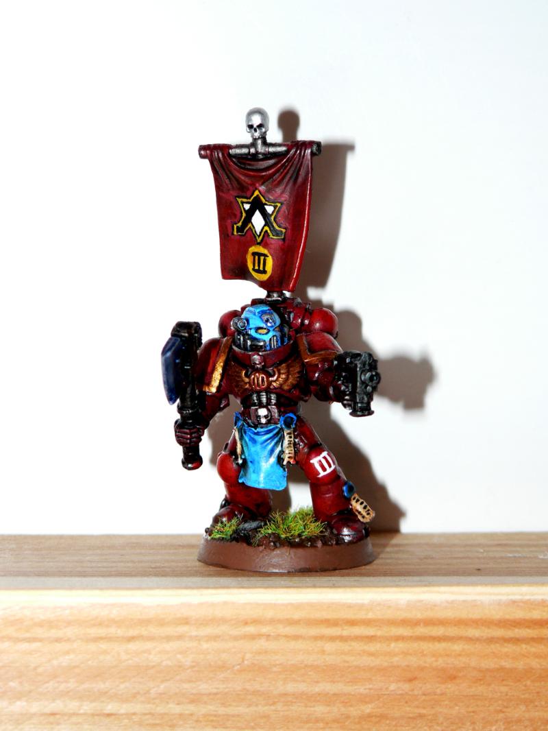
Probably the most important change is the Sergeant. I've decided to supplement the flamer combat squad with a new Sergeant; particularly because I wanted to arm the squad with a stronger close combat weapon, and particularly because I've grown quite allergic of the stock two-dimensional AOBR sergeant.

Sergeant Malleus, 3rd Tactical Squad, 2nd Company
As you can see, the new one is quite an improvement. The axe is a power weapon from Assault Squad sprue, and the other parts are standard Tactical Squad bits. I got quite bored of bare head marines, so I gave this one a helmet - in blue color, to represent sergeant status. I also stopped to paint marine eyes in Blood Red and instead went for Iyanden Darksun.
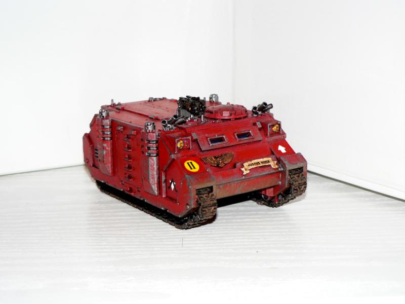
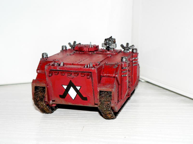
I've made minor changes to my first Rhino as well; after reading Insignium Astartes, I've found out I got the markings all wrong. So I've replaced them with a 2nd Company insignia and a tactical mark; note that the large tactical arrow is yet to be added. I also added a large Genesis Chapter logo on the back doors.


I'm still solving out my army list, and I'm thinking about actually putting this Tactical Squad into a Razorback, so that's why the Rhino still doesn't have squad markings. For some time though, the squad will use it as a dedicated transport, so here they are together:

And here is a better look on the squad markings, which are variously placed either on shoulder-pads or knee-pads:

As you can see, the squad is the third squad of Second Company (indicated by the golden shoulder-pad rim), Genesis Chapter. I'm afraid I quite messed up the Sergeant's banner, because the squad number insignia there looks too similar to a company badge - see the picture with Rhino to understand what I mean. I'll definately use different style of markings on future banners.
Anyways, thanks for reading! I hope you like the squad. As always, any comment or criticism is welcome. Do you think I should re-do the banner, to make it more apparent that it displays squad number? Or is it apparent enough?


%20-%20kopie.jpg)


Žádné komentáře:
Okomentovat